When it comes to running a D2C (Direct-to-Consumer) brand, your landing page is one of the most critical elements in your sales funnel. Imagine you’ve spent time and money driving traffic to your site—whether through social media ads, email campaigns, or organic search—only for visitors to land on a poorly optimized page.
The result? They leave without making a purchase, and your investment in getting them there goes to waste.
Why a Well-Optimized Landing Page is Crucial for D2C Brands
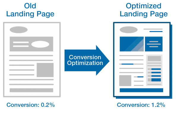
A landing page is like the digital front door to your brand. For D2C companies, where customers buy directly from you, it plays an even bigger role. It’s not just a place where people land; it’s a powerful tool that can turn a visitor into a paying customer—if done right. In fact, studies show that a well-optimized landing page can boost conversion rates by up to 300% compared to a standard page.
The purpose of this blog is to walk you through the best practices for building a landing page that isn’t just good-looking but functional. We’ll cover everything from crafting a compelling headline and product imagery to setting up persuasive offers and reducing friction in the buying process.
2. Understanding the Role of a D2C Landing Page

A Direct-to-Consumer (D2C) product landing page is built with a single goal in mind: to convert visitors into buyers or leads. Unlike a typical e-commerce homepage, which may showcase multiple products, promotions, and various sections like blogs or categories, a product landing page is laser-focused on one product or offer.
Here’s how conversion optimization works:
- Single Call to Action (CTA): The landing page uses clear, compelling CTAs like “Buy Now,” “Claim Your Offer,” or “Get Started.” There’s usually only one CTA to avoid confusion or distraction, increasing the likelihood of conversion.
- Fewer Distractions: Everything on the page, from the images to the copy, is crafted to guide visitors toward a specific action. Research shows that reducing distractions can significantly boost conversions. In fact, studies have found that removing navigation links from landing pages can increase conversion rates by up to 100%.
- Tailored Content: The content is highly focused on the visitor’s needs, the benefits of the product, and how it solves a problem. For example, including customer testimonials or reviews can increase trust and lead to more conversions. According to Trustpilot, 92% of consumers are more likely to make a purchase after reading a trusted review.
- Fast-Loading Pages: A study by Google showed that a 1-second delay in mobile page load time can impact conversion rates by up to 20%. Landing pages need to be optimized for speed, especially on mobile, where users expect instant access.
- Mobile Optimization: With mobile commerce accounting for 73% of total e-commerce sales in 2021, D2C brands need to ensure their landing pages are mobile-friendly. This means buttons should be easy to tap, images should load quickly, and the overall experience should be seamless on a phone.
Example:
Take a brand like Allbirds, known for their sustainable footwear. When launching a new shoe, they use a dedicated landing page highlighting the benefits of that specific shoe (comfort, eco-friendly materials) and pair it with a single “Shop Now” button. This approach led them to boost sales by 35% during product launches compared to standard product listings.
3. Key Elements of a High-Converting D2C Landing Page

A. Headline and Subheadline
Headline: Grabbing Attention in the First 5 Seconds The headline is the first thing your visitors see, and you have only a few seconds to grab their attention. A great headline should address the customer’s main problem or desire.
For instance, if you’re selling skincare products, your headline could say, “Clear, Radiant Skin in Just 30 Days – No Harsh Chemicals!”
Subheadline: Clarifying the Value Proposition Once your headline grabs attention, the subheadline should expand on the promise and clarify the product’s value. It can explain what makes your offer unique.
Using the same skincare example, a subheadline might say, “Our all-natural formula is clinically proven to reduce acne, brighten skin tone, and provide long-lasting hydration.”
B. Product Imagery and Videos
- Visuals: High-Quality Product Images and Demonstration Videos People are visual shoppers, especially in e-commerce. High-quality images and videos can make or break your landing page.
Ensure your images are clear, professional, and showcase your product from multiple angles. If possible, include videos showing the product in action. For example, a fitness brand could include a video of their equipment being used in different workout routines, giving customers a real sense of how it works.
Data shows that 64% of customers are more likely to buy a product online after watching a video about it. Videos are especially powerful in demonstrating products that require some explanation or that solve a specific problem.
C. Strong, Persuasive Copy
- Clear Value Proposition: Focus on Benefits, Not Just Features Your copy needs to highlight why the product matters to the customer. Instead of just listing features, focus on the benefits. For example, instead of saying “This phone has a 5000mAh battery,” you could say, “Enjoy 2 days of battery life on a single charge – no more worrying about running out of power.”
D. Social Proof and Testimonials
- Customer Reviews: Showcase User-Generated Content Customers trust other customers. According to a study, 93% of consumers say online reviews influence their purchase decisions. Showcase real customer reviews or testimonials prominently on your landing page. If possible, use user-generated content (UGC) like photos of actual customers using your product.
5. Building Trust and Reducing Friction

A. Guarantee and Return Policy
One of the most effective ways to build trust with potential customers is by offering a Money-Back Guarantee or a risk-free trial. This simple step shows that you stand behind your product and are confident in its value.
- Money-Back Guarantee: A risk-free trial or refund policy reassures customers that if the product doesn’t meet their expectations, they won’t lose money.
For example, Casper, the mattress company, offers a 100-night trial with free returns. This kind of guarantee helps hesitant customers make the purchase decision. - Clear Return Instructions: Complicated return policies are a major turn-off. Make your return policy simple and transparent.
For example, include clear steps for returns right on the landing page or via an easy-to-find link. Research by UPS found that 73% of consumers say the return experience impacts whether they’ll buy from a retailer again.
B. Fast, Easy Checkout
The checkout process is where many potential customers drop off. If it’s complicated or time-consuming, you’ll lose sales. Simplifying the checkout process can help reduce abandonment rates.
- Simplified Checkout Process: Implement one-click checkout or offer a guest checkout option to avoid forcing users to create accounts.
According to Baymard Institute, 24% of users abandon carts because they are forced to create an account. For example, Amazon’s 1-Click ordering has made shopping frictionless for millions of users. - Payment Options: Offering a wide variety of payment methods, such as credit cards, digital wallets (like Apple Pay, and Google Pay), and PayPal, gives customers flexibility and convenience.
Studies show that 56% of customers expect multiple payment methods. Fewer options can lead to lower conversions.
C. Trust Badges and Certifications
Trust badges and certifications reassure potential customers that your website is secure, reliable, and trustworthy. These visual cues act as trust triggers and reduce friction during the purchasing decision.
SSL Certification: Ensuring your website has SSL certification (and displaying the “secure checkout” badge) is essential. Data shows that 84% of users would abandon a purchase if they knew the website wasn’t secure.
An SSL certificate helps assure customers that their personal and payment information is safe.
6. Optimizing for Mobile and Speed

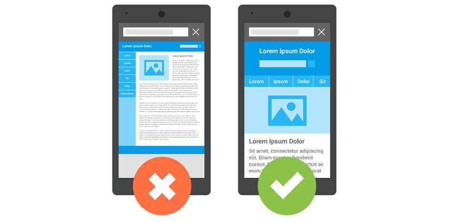
Optimizing your D2C landing page for mobile is non-negotiable. With over 58% of global web traffic coming from mobile devices, you need to ensure your landing page works flawlessly on smaller screens. Here’s how you can make it mobile-friendly:
Mobile-First Design:
Your landing page should be designed with mobile in mind first, not as an afterthought. A cluttered or poorly structured mobile layout can lead to higher bounce rates, and statistics show that 57% of users won’t recommend a business with a poorly designed mobile site.
Focus on simplicity — remove unnecessary elements that could slow down the page or make navigation confusing. Make sure the product images, text, and key selling points fit well into smaller screens without forcing users to zoom in or scroll too much.Overall :
Remember, your landing page is never a “set it and forget it” tool. Continuously A/B testing different elements—whether it’s headlines, offers, or CTAs—can lead to small but meaningful improvements. A good example of this is a recent case study showing that brands running regular A/B tests saw their conversion rates increase by an average of 25% over a year.


