
In the digital Ad world, your landing page is your first impression, your virtual handshake, and your ticket-to-customer conversion.
A high-converting landing page can be a game-changer for your business, transforming casual visitors into loyal customers. But what makes a landing page truly effective?
In this comprehensive guide, we dive into the art of creating landing pages that do more than just look pretty.
We uncover the science behind the success stories of industry leaders like Slack, Airbnb, and Doordash, and extract valuable takeaways for your marketing arsenal.
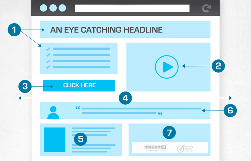
What does High Converting Landing Page Include:
A high-converting landing page is crucial for attracting and retaining customers. To create an effective landing page that converts, consider the following key elements:
- Clear and Compelling Headline: Your headline should immediately grab the visitor’s attention and convey the main benefit or value proposition of your offer. Make it concise and compelling.
- Engaging Visuals: High-quality images or videos can help convey your message and make your product or service more appealing. Use visuals that are relevant to your offer and audience.
- Persuasive Copy: The content on your landing page should be concise, easy to read, and persuasive. Clearly communicate the benefits of your product or service, addressing the visitor’s pain points and needs.
- Strong Call to Action (CTA): Your CTA should be highly visible and use action-oriented language. It should clearly tell visitors what you want them to do, such as “Sign Up Now” or “Get Started.”
- Minimal Distractions: Keep the landing page design clean and free from distractions. Minimize navigation options, links, and extraneous content that could lead visitors away from the conversion goal.
- Trust Signals: Build trust with your audience by including trust signals like customer testimonials, reviews, case studies, security badges, and partner logos. These elements can boost credibility.
- Social Proof: Showcase evidence that others have benefited from your product or service. This can include customer reviews, ratings, user-generated content, or success stories.
- Mobile Optimization: Ensure your landing page is responsive and optimized for mobile devices. With the increasing use of smartphones, a mobile-friendly design is essential.
- A/B Testing: Regularly test different elements of your landing page, including headlines, CTAs, images, and forms, to determine what resonates best with your audience. A/B testing helps you refine your page for better conversions.
- Value Proposition: Clearly state what makes your offer unique and valuable. Explain how it solves a problem or fulfills a need that your audience has.
- Emphasis on Benefits: Focus on the benefits, not just the features, of your product or service. How will it improve the visitor’s life? What problems will it solve?
- Form Optimization: If your landing page includes a form, keep it as short as possible, asking only for essential information. Long forms can deter visitors from converting.
- Urgency and Scarcity: Create a sense of urgency or scarcity by using phrases like “limited-time offer” or “only a few spots left.” This can encourage immediate action.
- Privacy and Security Assurance: If you collect personal information through your landing page, reassure visitors about their data’s security and privacy.
- Responsive Customer Support: Offer easy ways for visitors to get in touch with you for questions or assistance. A chat feature or contact information can be valuable.
- Load Time Optimization: Ensure fast loading times, as slow pages can lead to high bounce rates. Compress images, use content delivery networks, and optimize code.
- Consistent Branding: Maintain a consistent look and messaging with your brand. This helps build brand trust and recognition.
- Thank You Page: After a successful conversion, direct users to a thank you page that confirms their action and provides next steps or additional offers.
1. Get Response

GetResponse is a stellar example of a landing page that gets it right. It’s like a masterclass in effective marketing. With a powerful headline, captivating imagery, a list of impressive clients, and a comprehensive feature breakdown.
Now, let’s break down three key takeaways from GetResponse’s exceptional landing page:
1. Power of Highlighted Copy
GetResponse employs a simple yet potent technique to make their copy more impactful. They strategically highlight important words and phrases throughout the landing page. This clever use of emphasis draws your attention, making their copy stand out and resonate with you.
When crafting your landing page copy, consider the strategic use of emphasis to ensure your key messages pop and leave a lasting impression.
2. Multiple Calls to Action (CTAs)
One of the secrets to GetResponse’s landing page success is their use of multiple CTAs. Given the page’s length, they scatter these CTAs at the end of every section. This approach is both user-friendly and strategic.
It acknowledges that visitors may need multiple touchpoints before deciding to take action. Whether you’re crafting a long or short landing page, distributing CTAs at strategic points throughout can boost your conversion rates.
3. Engaging Imagery for Instant Connection
GetResponse has another ace up its sleeve with a bevy of friendly faces adorning their landing page. This choice of imagery serves a vital purpose—it helps to build an instant connection with potential customers.
In sum, GetResponse’s landing page is a prime example of how careful attention to detail, including highlighted copy, multiple CTAs, and engaging imagery, can significantly boost your landing page’s effectiveness.
By using these principles into your own landing page strategy, you can create a more compelling and conversion-driven user experience.
2. Slack
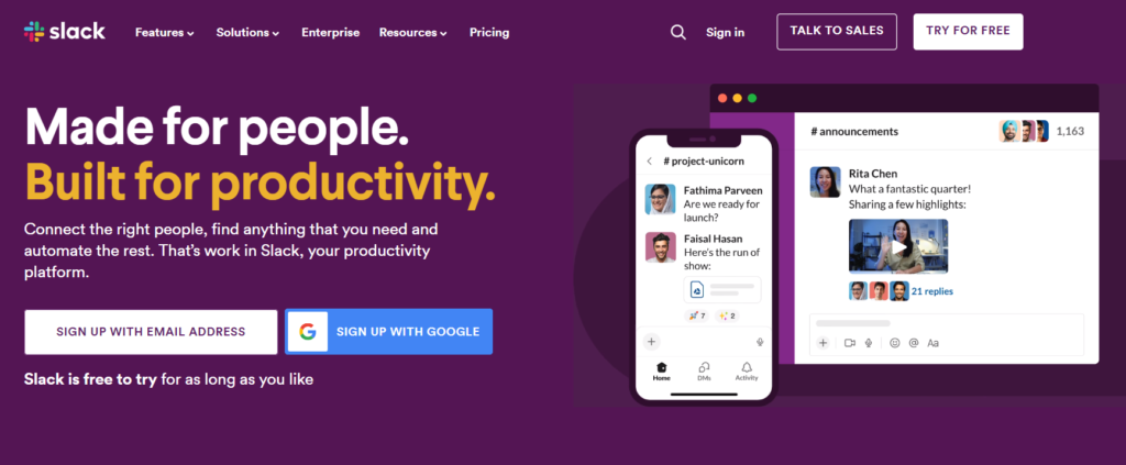
Slack is a prime example of a landing page that seamlessly combines the art and science of marketing. It’s not just visually appealing, but also highly effective in conveying its value proposition to potential users. Let’s break down Slack’s landing page and explore what makes it a standout in the marketing world.
3 Takeaways from Slack’s Landing Page:
- Simplicity is Key: Slack’s landing page is uncluttered and devoid of unnecessary distractions. It’s all about the message and user experience. Simplicity and clarity in design make it easy for visitors to understand the product’s value.
- Show, Don’t Just Tell: Instead of long-winded explanations, Slack uses visuals to convey the essence of its platform. By showing potential users what they can expect, it creates a stronger impact and understanding.
- Multiple CTAs for Diverse Audiences: Recognizing that not all visitors are at the same stage of their buyer’s journey, Slack offers multiple CTAs. This allows them to cater to users in different decision-making phases and ensures that no potential lead is lost.
Slack’s landing page is an excellent example of how marketing can be both visually appealing and highly effective in converting visitors into users.
3. ActiveCampaign
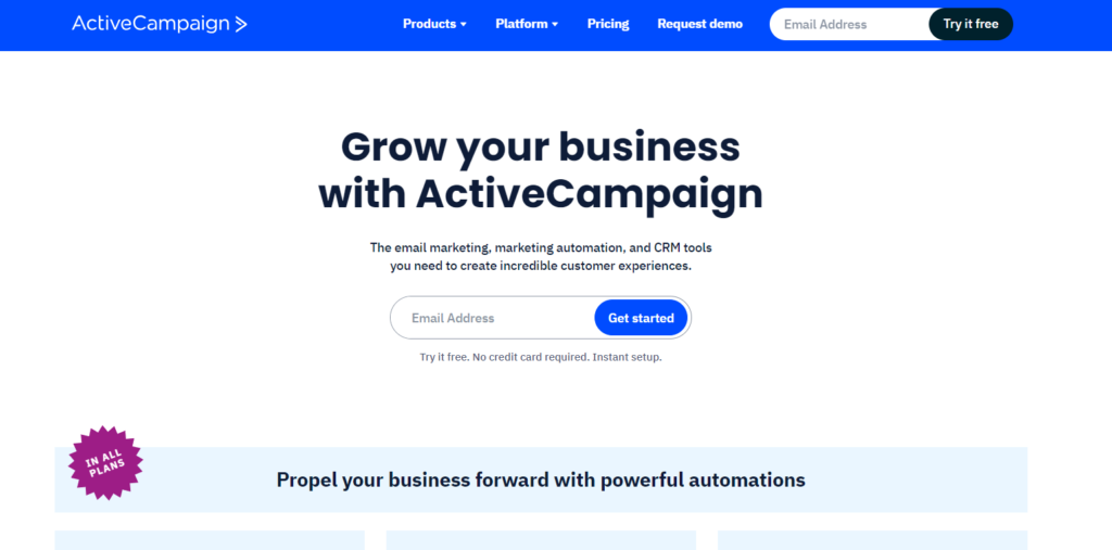
ActiveCampaign, a marketing automation platform, sets a remarkable example of how personalization can significantly impact the effectiveness of a landing page. Let’s dive into their landing page and discover four key takeaways.
4 Takeaways for Your Landing Page
- Personalization is key. Understand your audience’s needs and pain points, and tailor your content accordingly.
- Craft a clear and compelling value proposition. Your visitors should instantly understand why your product or service is beneficial.
- Use persuasive, action-oriented copy. Tell your visitors what to do next with a compelling Call to Action.
- Your landing page should never leave your audience wondering what they should do. Use persuasive copy and a compelling CTA to guide them.
- Incorporate trust signals and social proof. Build credibility by showcasing positive customer experiences and endorsements.
4. Webflow
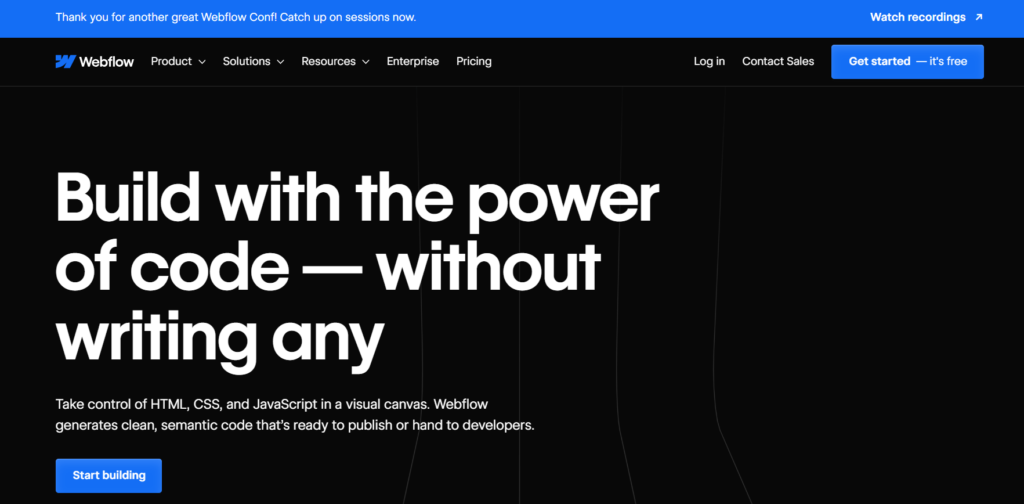
One of the standout features of Webflow’s landing page is its simplicity. The company wisely avoids overwhelming visitors with excessive information, instead opting for a clear and concise message.
- Keep it simple. Avoid clutter and aim for clarity in your landing page design. Focus on a concise message that your target audience can quickly grasp.
- Invest in high-quality visuals that align with your brand identity. A visually appealing landing page can captivate your audience and leave a lasting impression.
- Craft a clear, compelling, and action-oriented CTA. Make it easy for visitors to take the desired action, whether it’s signing up, downloading, or making a purchase.
- Focus on communicating the benefits of your product or service. Explain how it solves problems or improves the lives of your customers. Speak directly to their needs and desires.
By keeping things simple and clear, utilizing a visually engaging design, featuring a single clear CTA, and emphasizing benefits, Webflow successfully captures the attention of its audience and converts them into users
5. ClickFunnels
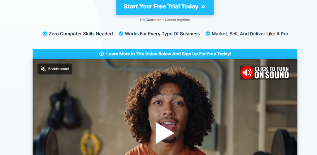
ClickFunnels’ landing page appears deceptively simple. It’s not flashy, it doesn’t bombard you with a plethora of images, and there’s no excess of text. However, there’s a method to this minimalism.
4 Takeaways from ClickFunnels’ Landing Page:
Clarity is Key: A clear and concise message can work wonders. Ensure that your landing page conveys its value proposition succinctly, so visitors instantly understand what you’re offering.
Simplicity Sells: Don’t clutter your landing page with distractions. Focus on the user’s journey and make your call to action the central point of attention.
Video Power: If your product or service is complex, use video to explain it. Storytellingand visual content can make a significant impact.
Tell Them What They’ll Get: Clearly outline the benefits visitors will receive. Break it down in a straightforward, easy-to-read format. Visitors should know what’s in it for them.
It’s about clear messaging, minimalistic design, engaging video content, and a laser-focused call to action.
By implementing these principles, you can craft a landing page that not only captivates your audience but also drives conversions.
6. Neil Patel
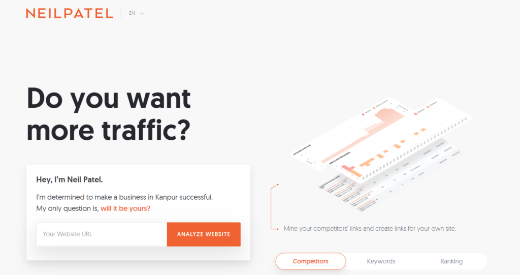
Neil Patel’s landing page is a prime example of how an expert in digital marketing can effectively use simplicity, compelling content, personal branding, and clear CTAs to engage and convert visitors.
Prioritize Simplicity: Keep your landing page clean and uncluttered. Avoid unnecessary distractions and focus on a straightforward design that guides visitors to the essential content and calls to action.
Content Is King: Provide valuable content directly on your landing page. Share resources, blog posts, or other materials that showcase your expertise and provide immediate value to your visitors.
Leverage Personal Branding: If you’re a recognized expert in your field, don’t shy away from personal branding. Use your name and image to build trust with your audience and reinforce your authority.
Craft Clear CTAs: Your call to action should be clear, persuasive, and action-oriented. Encourage visitors to take the desired action with language that creates a sense of urgency and benefits.
7. Airbnb
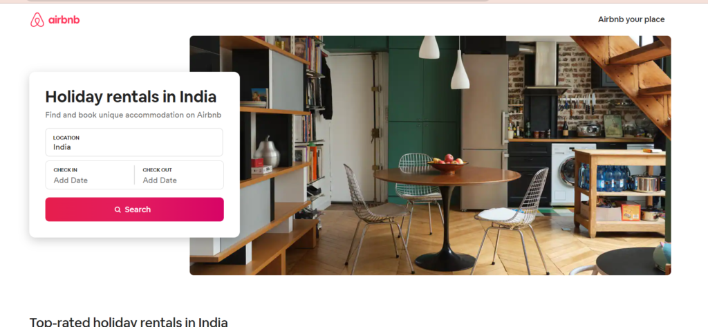
At Airbnb, the landing page is your virtual passport to a world of unique travel experiences. It’s your introduction to the idea that travel isn’t just about where you go; it’s about how you live while you’re there.
Let’s break down the key elements of Airbnb’s landing page:
4 Takeaways for Landing Page Builders:
- Prioritize Trust Building: Incorporate elements that build trust on your landing page, such as user reviews, testimonials, or trust badges. Visitors need to feel secure when taking action on your site.
- Personalization Matters: Leverage user data to create a personalized experience for visitors. Tailor your content to their location, preferences, or past interactions to make them feel more connected to your brand.
- Visual Storytelling: Use high-quality, emotionally appealing images that resonate with your target audience. People are drawn to visual storytelling, so choose images that tell a compelling story about your product or service.
- Simplify Navigation: Make sure your landing page is user-friendly and intuitive. Visitors should be able to find what they’re looking for with ease. A cluttered or confusing layout can deter potential customers.
8. Conversion Lab
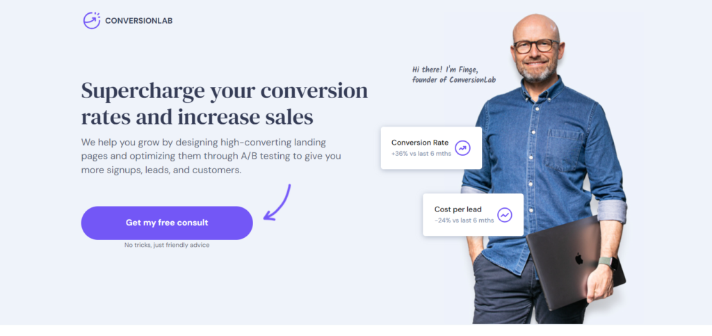
Conversion Lab
Conversion Lab is a prime example of a company that knows how to convert curious visitors into enthusiastic leads. Their landing page is a shining beacon of effective lead generation, and here’s why you should take notes on their approach.
1. User-Centric Design
The primary message and the call-to-action (CTA) are front and center, ensuring that visitors don’t have to hunt for what they need. A clean design like this helps to reduce bounce rates and improve conversion rates.
2. Irresistible Lead Magnet
Conversion Lab offers a valuable lead magnet that’s hard to resist. In exchange for a visitor’s contact information, they provide a free, high-quality resource.
3. Trust Signals and Social Proof
Trust is essential in lead generation. Conversion Lab understands this and incorporates trust signals throughout its landing page. They showcase recognizable client logos, provide testimonials, and mention impressive statistics.
4. A/B Testing and Continuous Improvement
By monitoring and analyzing user behavior, Conversion Lab ensures the landing page is always evolving to maximize conversions
In summary, Conversion Lab’s landing page is a model of excellence in lead generation. By keeping the design user-centric, offering an irresistible lead magnet, incorporating trust signals, and embracing A/B testing for continuous improvement.
9. Door dash’s
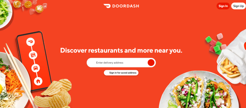
Imagine you’re hungry, craving your favorite meal, but you don’t want to cook or go out. What do you do? Well, you probably open the DoorDash app or visit their website. It’s not just the delicious food they deliver; it’s also how they serve it up on their landing page that’s worth admiring.
1. The Power of Mobile Optimization
Doordash’s landing page is a prime example of mobile optimization. The clean, clutter-free layout immediately makes it clear that it’s designed for users on the go. The large, enticing images of food combined with a straightforward call-to-action (“Order Now”)
2. Speed and Performance Matter
One thing we all despise when using an app or website is sluggishness. Doordash recognizes this and ensures its landing page loads quickly. Speed is essential, especially for a service where customers want to order food in a hurry.
3. The Value of Geolocation
Doordash smartly employs geolocation services. When you visit their landing page, it detects your location and immediately provides a list of nearby restaurants and delivery options
4. Prominence of Visual Cues and Social Proof
Pictures of delicious food do more than just tempt the taste buds; they also build trust. Doordash includes images of the dishes they offer, and they regularly update these images to showcase a variety of choices.
Overall Door dash’s landing page succeeds by prioritizing mobile optimization, speed, geolocation services, and trust-building elements
FAQs
A landing page is designed to capture a visitor’s information or encourage a specific action, such as signing up, making a purchase, or downloading content. Its primary goal is to convert visitors into leads or customers.
Mobile optimization is essential because an increasing number of users access websites and landing pages via smartphones and tablets. If your landing page isn’t mobile-friendly, you risk losing potential customers due to a poor user experience on smaller screens.
Trust can be built through various elements on your landing page, such as customer testimonials, reviews, ratings, case studies, security badges, and partner logos. These elements help convey credibility and reliability.
Features describe the characteristics or capabilities of your product or service, while benefits explain how those features solve problems or improve the user’s life. Effective landing pages focus on the benefits of connecting with the audience on a deeper level.
A/B testing involves creating variations of your landing page and comparing their performance to determine which elements or content resonate best with your audience. This iterative approach helps you refine your landing page and increase its conversion rates over time by using data-driven decisions.