Turning website visitors into paying users is the holy grail of online marketing, and crafting a compelling landing page is your secret. The good news? We have proven formulas.
Enter AIDA, PAS, and BAB – three titans of the conversions, ready to transform your bland pages into lead magnets.
Get to learn:
The Core Three:
- AIDA (Attention, Interest, Desire, Action):
- Explained each stage of the AIDA model in detail with examples. Highlight the strengths and weaknesses of AIDA.
- PAS (Problem, Agitate, Solve):
- Unpacked the PAS formula and its emphasis on emotional engagement. Provided tips for crafting compelling problem statements and agitations. Shared landing page examples that masterfully implement PAS.
- BAB (Before, After, Bridge):
- Demystify the BAB formula and its focus on visualization and transformation. Explained how to paint vivid pictures of desirable “After” scenarios.
Formula Fusion:
- Discussed the benefits of combining elements from different formulas. Provided examples of successful hybrid formulas in action. Encourage experimentation and customization based on brand and audience.
Beyond the Formulas:
- Emphasized the importance of strong visuals, clear CTAs, and A/B testing. Briefly touch on landing page best practices (mobile responsiveness, concise copy, etc.). Offered additional resources for further learning and formula exploration.
Conclusion:
- Recap the key takeaways of each formula.
The Core Three: AIDA (Attention, Interest, Desire, Action)
AIDA, the OG of landing page formulas, has been guiding conversions for over a century. Let’s break down its four stages:
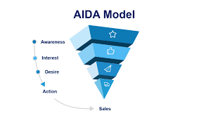
Image credit: google.com
1. Attention:
Hook ’em right from the jump! Think bold headlines, striking visuals, or surprising stats. This is where you fight for those precious milliseconds of visitor attention.
2. Interest:
Now that you’ve got their eyes, keep their minds engaged. Explain your pain point, showcase unique benefits, and tell a compelling story. Make them lean in and want more.
3. Desire:
Light the fire of WANT! Highlight the emotional benefits, showcase user testimonials, and paint a picture of their transformed life after using your product. Make them dream it.
4. Action:
Don’t leave them hanging! Provide a clear call to action (CTA) that’s easy to find and irresistible to click. Make taking the next step effortless and rewarding.
Strengths of AIDA:
- Structured and easy to follow: A clear roadmap for crafting engaging landing pages.
- Versatile: Adaptable to any product or service.
- Proven track record: A classic for a reason!
Weaknesses of AIDA:
- Can feel formulaic: May lack authenticity if not implemented creatively.
- Focuses on rational persuasion: Doesn’t always tap into emotional triggers.
AIDA in Action:
Now, let’s see AIDA work its magic on two real-world landing pages:
- Dropbox: Their “Effortless Collaboration” campaign uses bold visuals, clear value propositions, and customer testimonials to pique interest and build desire for seamless file sharing.
- Slack: Their “Where Work Gets Done” landing page emphasizes productivity gains and team communication improvements, painting a picture of a stress-free, efficient work environment.
Remember, AIDA is just a starting point. Experiment, personalize, and infuse your brand’s unique voice to make it truly YOUR conversion superpower.
PAS: Where Problems Become Powerful Persuaders
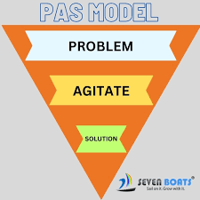
Image credit: google.com
Forget about sugarcoating things, PAS thrives on the raw power of human struggles. Let’s unpack this formula:
1. Problem:
Identify your target audience’s pain points, fears, and frustrations. Make them feel heard and understood.
Tips:
- Use relatable language and concrete examples.
- Go beyond surface-level concerns and reveal deeper anxieties.
- Don’t just describe the problem – make them FEEL it.
Example:
2. Agitate:
Twist the knife a little! Don’t shy away from amplifying the consequences of their problem. Show them how it’s holding them back from their desired life.
Tips:
- Use vivid imagery and strong verbs to evoke negative emotions.
- Offer statistics or personal stories to add realism.
- Don’t dwell on negativity, but build momentum towards the solution.
Example:
3. Solve:
Be the hero they’ve been waiting for! Introduce your product or service as the answer to their prayers. Make it clear how it solves their problem and delivers the desired outcome.
Tips:
- Focus on the benefits, not just the features.
- Show, don’t tell – use visuals and testimonials to bring your solution to life.
- Offer a clear and compelling call to action that leads them to their happy ending.
PAS in Action:
See how PAS masters emotional engagement in these real-world landing pages:
- Headspace: Their “Take 10” campaign starts by acknowledging daily stress, amplifies its negative effects, and then positions Headspace as the easy, accessible solution for inner peace.
- Grammarly: They address the fear of poor writing and its professional consequences, then showcase Grammarly as the ultimate spell-checking savior for confident communication.
Remember, PAS is a delicate tool. Don’t wallow in negativity, but use it to fuel the desire for a better solution.
BAB: Where Dreams Ignite Action
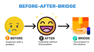
Image credit: google.com
Picture this: a frustrated freelancer drowning in endless emails, then seamlessly managing their inbox with a powerful tool. That’s the magic of BAB, the formula that paints a transformative picture of your audience’s “After.” Let’s break it down:
1. Before:
Step into your audience’s shoes. Describe their current reality, the struggles they face, and the frustrations they experience. Make them feel seen and understood.
Tips:
- Use relatable language and specific scenarios.
- Highlight pain points without dwelling on negativity.
- Set the stage for a dramatic transformation.
2. After:
Show your audience how their life will be different after using your product or service. Focus on the positive emotions, the desired outcomes, and the newfound freedom they’ll experience.
Tips:
- Use vivid imagery and evocative language.
- Focus on the emotional benefits, not just the features.
- Make the “After” scenario feel achievable and aspirational.
3. Bridge:
Build the bridge between dreams and reality. Explain how your product or service makes the “After” possible. Showcase its features and benefits in a way that directly addresses the “Before” problems.
Tips:
- Use clear and concise language.
- Highlight testimonials and case studies to add credibility.
- Offer a compelling call to action that invites them to cross the bridge.
BAB in Action:
See how BAB leverages the power of transformation in these real-world landing pages:
- Peloton: Their “New Year, New You” campaign showcases the before-and-after stories of real people who achieved fitness goals with Peloton, painting a compelling picture of a healthier, happier “After.”
- Airbnb: Their “Live Like a Local” campaign takes viewers on a journey through unique homes and experiences around the world, inspiring them to ditch the tourist traps and embrace the “After” of authentic travel.
Remember, BAB is all about making your audience dream big and then showing them the tangible steps to get there. Use it to ignite their imagination and guide them towards the happily ever after that awaits.
With these three formulas at your disposal, you’re now equipped to craft landing pages that not only grab attention but also drive conversions. Remember, the key is to understand your audience, speak to their emotions, and show them how your product or service can make their lives better.
Formula Fusion:
AIDA’s attention-grabbing headlines meet PAS’s emotional depth and BAB’s transformative vision. Welcome to the realm of Formula Fusion, where you combine the strengths of each approach to craft truly irresistible landing pages.
Why Fuse?
- Multiplied Impact: Harness the unique strengths of each formula to create a multi-layered persuasion strategy.
- Deeper Connection: Tap into both rational and emotional triggers, fostering a stronger bond with your audience.
- Unleash Creativity: Break free from formulaic constraints and experiment with personalized combinations.
Hybrid Masterpieces:
- AIDA + PAS: Start with AIDA’s attention-grabbing hook, then use PAS’s “Problem-Agitate-Solve” sequence to deepen engagement and highlight emotional benefits before ending with a clear call to action.
- BAB + AIDA: Paint a vivid “After” picture using BAB, then pique curiosity with AIDA’s headline and offer concrete details about your solution to bridge the gap between dream and reality.
- PAS + BAB: Identify core problems and amplify anxieties with PAS, then showcase the transformative “After” your product delivers using vivid imagery and testimonials, and finally, bridge the gap with a tangible call to action.
Remember:
- Balance is key: Don’t overwhelm your audience with a jumble of elements. Choose a dominant formula and use others subtly to enhance its impact.
- Know your audience: Tailor your fusion based on their needs, preferences, and emotional response patterns.
- Experiment and iterate: Don’t be afraid to try different combinations and test their effectiveness with A/B testing.
Formula Fusion is your playground, not a rigid prescription. Embrace the freedom to customize, experiment, and find the perfect blend that resonates with your audience and ignites conversions.
Beyond the Formulas:
Crafting a compelling landing page with the right formula is a powerful first step. But to truly convert your visitors into customers, remember to go beyond the theoretical framework and add some practical polish.
Visual Appeal:
- Eye-catching Images: Your landing page shouldn’t be a text wall. High-quality visuals that resonate with your brand and message can instantly grab attention, evoke emotions, and tell a story without words. Don’t underestimate the power of a stunning hero image or a series of relevant product shots.
- Strategic Video Placement: A well-crafted video can showcase your product or service in action, demonstrate its benefits, and connect with viewers on a deeper level. Consider incorporating a short, impactful video near the top of your page to further engage your audience.
Clear Calls to Action (CTAs):
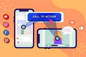
Image credit: google.com
- Actionable Buttons: Your CTA should be prominent, easy to find, and impossible to ignore. Use strong verbs like “Start Now,” “Get Your Free Trial,” or “Download Now” and pair them with contrasting colors to make them stand out.
- Minimize Friction: The path to conversion should be smooth and effortless. Keep your CTA straightforward, avoid requiring unnecessary information in forms, and ensure seamless navigation to avoid losing potential customers at the last hurdle.
A/B Testing is Your Friend:
- Data-Driven Optimization: Don’t just guess what works – test it! A/B testing allows you to compare different versions of your landing page elements, from headlines and visuals to CTAs and layout. This data-driven approach helps you identify the elements that resonate best with your audience and optimize your page for maximum conversions.
Landing Page Best Practices:
- Mobile-First Design: With the majority of internet traffic coming from mobile devices, ensuring your landing page is responsive and displays flawlessly on any screen size is crucial.
- Concise Copy: Keep your text clear, concise, and benefit-oriented. Avoid jargon and technical terms, and focus on communicating the value your product or service offers in a way that resonates with your target audience.
- Social Proof: Testimonials, customer reviews, and case studies can add credibility and build trust with potential customers. Showcase the positive experiences others have had with your brand to encourage visitors to take the leap.
Ready to Explore Further?
To delve deeper into specific formulas and discover additional best practices, check out these resources:
- Unbounce: Offers a wealth of landing page articles, templates, and guides, including detailed breakdowns of AIDA, PAS, and BAB formulas.
- HubSpot Blog: Shares practical landing page creation tips and insights from marketing experts, covering everything from copywriting to design and conversion optimization.
- Kissmetrics: Provides actionable advice on landing page optimization, A/B testing, and data-driven decision making to maximize your conversion rates.
Remember, a successful landing page is a carefully crafted blend of persuasion, engagement, and user experience. Use the formulas as a guiding light, but don’t be afraid to experiment, personalize, and iterate based on your audience and data insights. With a little polish and ongoing optimization, you can transform your landing pages into conversion powerhouses that attract, engage, and convert visitors into loyal customers.
By implementing these additional elements, you can ensure your landing pages are not only strategically formulated but also visually appealing, user-friendly, and optimized for maximum conversions. Remember, continuous learning and exploration are key to staying ahead of the curve in the world of online marketing. Utilize the resources provided to delve deeper into your chosen formulas and discover best practices that resonate with your brand and audience. With dedication and experimentation, you can craft landing pages that not only capture
It’s time to raise the anchor and set sail on your very own conversion voyage.
AIDA: This classic captain remembers, attention is the lifeblood of engagement. Hook ’em, pique their interest, ignite desire, and lead them to action with a clear call to the helm.
PAS: This emotional buccaneer knows the power of a good storm. Stir the pot of their problems, let the anxieties build, and then reveal your product as the beacon of calm that brings peace and progress to their shores.
BAB: This visionary navigator paints a picture of paradise. Show them the “After” they crave, make it vivid and attainable, and build the bridge with your solution, guiding them from dream to reality with a compelling call to chart a new course.
But remember, formulas are just the compass, not the map. To truly conquer the conversion seas, you need:
- Eye-catching visuals: Images and videos that anchor your message in their minds.
- Clear CTAs: Bold buttons that guide them to their treasure island.
- A/B testing: Constantly refine your course based on data-driven insights.
- Mobile-first design: Chart a course for every screen size.
- Concise copy: Avoid jargon, let the benefits be the wind in your sails.
- Social proof: Show them the happy customers who’ve reached their destination.
Landing Rate = (Conversions / Visitors) * 100%
Analyze visitor behavior, compare across different campaigns, and test variations to optimize your landing page for maximum conversions.

