Introduction
The world of online shopping is always shifting, and having a good website is no longer enough. Imagine your website as a shop, and the landing page is like the front door. It’s the first thing people see, and if it’s inviting and helpful, they’re more likely to come in and buy something.
A. How Online Sales Are Changing in 2024
The way people buy things online is always evolving, especially in 2024. It’s not just about having a nice website; it’s about making sure that when people visit, they have a good experience.
In this fast-paced digital era, having a high-converting landing page in 2024 is crucial for turning visitors into customers.
B. Why Landing Pages Are Super Important for Conversions
Enter the landing page. This is the special page on your website designed to guide people into making a purchase. It’s like a friendly guide leading visitors through the store, showing them the best stuff, and making them feel comfortable enough to buy something.
Having a high-converting landing page in 2024 means ensuring that your page is not just a digital storefront but a strategic tool for boosting sales.
Your landing page is the first impression you give to potential customers. It’s not just about looking good; it’s about being smart and making sure your visitors become loyal customers.
C. Exciting Strategies for Boosting Conversions in 2024
Now, as we step into 2024, we’re about to explore some really cool and easy tricks to make your landing page work even better. We’ll share seven simple ways to make your page not just interesting but also highly effective in turning curious visitors into happy customers. We’ll talk about catchy headlines, using customer stories, and other neat ideas to ensure your landing page is a high-converting one in 2024.
It’s not about being fancy; it’s about knowing what your visitors want, saying the right things, and using some cool tricks.
Our goal is to help you make landing pages that really work in 2024 and make your online shop stand out in the world of high-converting landing pages.
So, get ready as we go on an adventure to make your landing page awesome for boosting sales in 2024.
Understanding Your Target Audience
If you’re aiming to create high-converting landing pages in 2024, the starting line is getting to know the folks you want to turn into customers. Let’s break it down into simple steps.
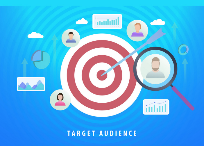
A. Creating Buyer Personas
Imagine crafting a detailed picture of your perfect customer – that’s making a buyer persona. It’s like putting together info on age, job, and the issues they want solutions for. If your thing is in the tech world, think about someone who loves the latest gadgets.
This helps you make content that fits your audience perfectly, especially for those looking for high-converting landing pages in 2024.
B. Conducting Market Research
Think of market research as your roadmap to creating a landing page that really clicks. See what others in your field are up to, catch the trends, and know what’s happening in your industry in 2024. Check out reviews, read reports, and keep tabs on social media.
This gives you the scoop on what your audience wants right now in terms of high-converting landing pages in 2024.
C. Tailoring Landing Pages to Specific Segments
Now, use what you’ve learned to shape your landing pages. If your business serves different kinds of customers, make landing pages just for them.
For example, if your product suits both budget-minded buyers and those aiming for top-notch quality, create separate pages for each. Make sure each page talks directly to that group, especially if they’re on the lookout for high-converting landing pages in 2024.
If your ideal customer is a young professional who wants things quick and easy, make sure your landing page shouts about how your product is a time-saver and looks amazing – the kind of high-converting landing page they’re searching for in 2024.
Understanding your audience means more than just knowing basic info about them; it’s about getting what they dream about and what bugs them. Nail this, and your landing pages won’t just grab attention – they’ll transform curious visitors into happy customers, boosting your sales in 2024 and beyond with those sought-after high-converting landing pages.
Clear and Compelling Headlines
A. Why Headlines Matter for Your High-Converting Landing Page in 2024
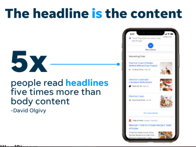
Imagine your landing page as a virtual storefront. The headline is like a welcoming sign that grabs attention and gets people interested. Here’s why headlines are crucial for building high-converting landing pages in 2024:
1. First Impressions Stick:
Your headline is the first thing visitors see. It’s like saying “hello.” If it’s interesting, they’ll want to stick around.
Example: “Hello to 10x Sales: Unlock the Secrets Now!”
2. Quick Attention-Grabber:
People online have short attention spans. A good headline is like a friendly tap on the shoulder, saying, “Hey, look at this!” Example: “Attention Business Owners: Skyrocket Your Conversions Today!”
3. Tells Them What’s Inside:
Your headline is a sneak peek into what your page offers. It should shout, “This is what you’ve been looking for!”
Example: “Discover the Ultimate 2024 Guide to High Converting Landing Pages.“
B. Tips for Making Headlines That Work
Crafting a great headline is simpler than it sounds. Here are some tips to make sure your headlines stand out and attract clicks for your high-converting landing page in 2024:
1. Be Clear, Not Clever:
Don’t make it a puzzle. Make sure your headline says exactly what you mean.
Example: “Transform Your Sales with Our Proven 2024 Strategies.”
2. Use Exciting Words:
Words like “exclusive,” “discover,” or “proven” catch the eye.
Example: “Exclusive Insights: Discover the Secrets to High Converting Pages in 2024-
3. Keep it Short and Sweet:
Short headlines are like a good joke-they’re easy to remember. Aim for 5 to 10 words.
Example: “Boost Sales Now: Expert Tips for 2024.”
4. Solve Their Problems:
If your product solves a problem, say it in the headline.
Example: “Say Goodbye to Low Conversions Try Our 2024 Strategies Today.”
5. Test, Test, Test:
Try different headlines and see which one works best. Use A/B testing to find the winner.
Example: “Test A: Boost Sales Today vs. Test B: Skyrocket
C. Testing Your Headlines for High Conversions in 2024
Okay, you’ve got a headline. Now, how do you know it’s the best one? Here’s where testing comes in:
1. Make a Guess:
What do you think will make your headline work better? Maybe it’s a specific word or a promise of something exciting.
Example: “Guess: ‘Revolutionize’ will beat ‘Improve’ in the headline.”
2. Change One Thing at a Time:
Don’t change everything at once. If you do, you won’t know what made the difference.
Example: “Change the word ‘Boost’ to ‘Skyrocket’ and see what happens.”
3. Look at the Numbers:
Use tools to see which headline gets more clicks and sales. The one with better numbers is the winner.
4. Keep Improving:
If you find a winner, great! But don’t stop there. Keep testing and tweaking to make your headlines even better.
So, in a nutshell, your headlines are like the superheroes of your landing page. They grab attention, tell your story, and drive people to take action.
With a bit of testing and creativity, you can create headlines that turn your landing page into a high-converting powerhouse in 2024!
Engaging Visual Elements for a High-Converting Landing Page
When it comes to building a high-converting landing page-a webpage that turns visitors into excited customers visuals are your secret weapon.
Let’s dive into why they’re crucial and how to pick the best ones, peppered with examples:
A. Why Visuals Are Your Landing Page Superpower
1. First Impressions: Your landing page is like a first handshake. Use visuals to make it
memorable. For instance, if you’re selling cozy blankets, showcase an inviting image of someone wrapped up in warmth.
Example:

2. Feelings Matter:
People connect with emotions. If you’re a fitness brand, a picture of someone achieving a fitness goal creates a positive vibe and encourages action.
Fitness Goal Example:

3. Easy to Remember:
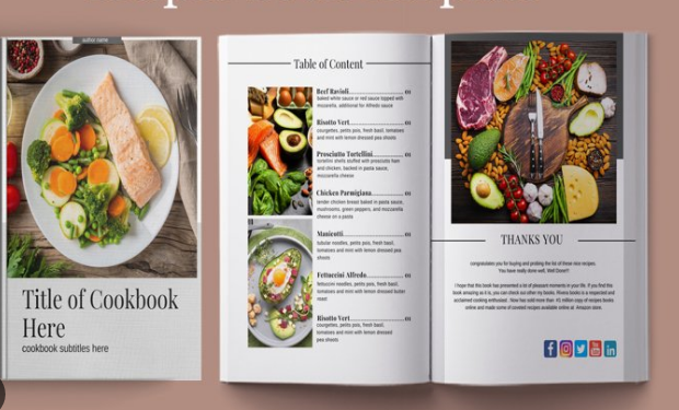
A picture is worth a thousand words, right? Let’s say you’re promoting a recipe book-use mouth-watering images to help visitors imagine the delicious dishes they can create.
Recipe Book Example
B. How to Choose Images that Convert Like Crazy
1. Stay on Topic:
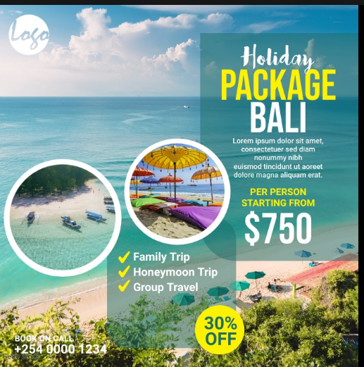
Imagine you’re selling travel packages. Include images of breathtaking destinations, not unrelated things like office supplies.
Travel Package Example:
2. Super Clear:
Imagine you’re selling tech gadgets. High-quality images showcasing the product from different angles give customers confidence in what they’re buying.
Tech Gadget Example

3. Look the Same:
If you’re a clothing brand, maintain a consistent style in your visuals. This builds a brand identity. Imagine a webpage with a mix of vintage and modern fashion-it might confuse visitors.
Consistent Style Example

C. Using Videos for Extra Conversion Power
1. Tell a Story:
Let’s say you’re promoting a productivity app. Use a video to show someone going from chaotic workdays to organized bliss thanks to your app.
Example: Productivity App
2. Explainer Videos:
If you’re offering a service like graphic design, an explainer video can show the process, making it easy for visitors to understand what you do.
Example: Graphic Design Service
3. Put it in the Right Spot:
For a landing page promoting an online course, placing a video near the “Enroll Now” button can increase conversions by giving visitors a preview of what they’re signing up for.
Example: Online Course
In a nutshell, when you’re aiming for a high-converting landing page, visuals are your best buddies. Choose images and videos that tell a story, create an emotional connection, and keep your brand style consistent. This approach ensures your landing page doesn’t just attract visitors but transforms them into enthusiastic customers.
Optimizing for Mobile Devices
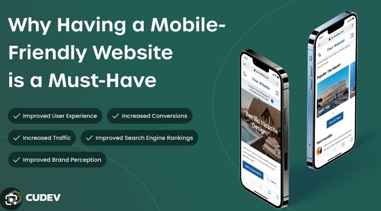
In the fast-paced digital world of 2024, if you want your landing page to be a magnet for conversions, it needs to be best friends with mobile devices. Let’s dive into why this friendship matters and how you can make it happen, with a sprinkle of real-life examples.
A. Why Mobile-Friendly Design Matters
Imagine your landing page is throwing a party, and everyone is invited, especially mobile users. Here’s why it’s a must-have guest list:
1. Mobile Madness:
Almost everyone does their online thing on phones. If your landing page isn’t joining the mobile party, it might miss out on tons of guests.
Example: A clothing store noticed a 30% increase in mobile traffic after making their landing page mobile-friendly. More visitors meant more sales!
2. Google’s Approval:
Google is like the bouncer of the internet. If your page is cool with mobiles, Google gives it a thumbs up, boosting its popularity.
Example: A travel agency saw a jump in search rankings after optimizing their landing page for mobile. More visibility meant more clicks.
3. Happy Users, Happy Sales:
When your page is a joy to use on phones, visitors are more likely to stick around and become customers.
Example: An online course platform improved its mobile experience, leading to a 25% increase in course sign-ups from mobile users.
B. Making It Fit with Responsive Design
Think of responsive design as the superhero outfit for your landing page that looks good everywhere. Here’s how to dress your page for success:
1. Flexibility is Key:
Use flexible sizes that adapt to different screens. It’s like having a page that knows how to dress for every occasion.
Example: An e-commerce site redesigned its product pages with flexible sizing. Now, whether on a big tablet or a small phone, products always look appealing.
2. Media Queries Magic:
These are like style suggestions for your page. They ensure your page looks sharp on any device, like a chameleon changing colors.
Example: A blog site implemented media queries to adjust font sizes and layouts. Readers on mobile devices now enjoy an optimized reading experience.
3. Showcase the Star Attractions:
Highlight what’s important, so it’s front and center on smaller screens. Think of it as putting your best foot forward but for your landing page.
Example: A software company reorganized its landing page for mobile users, placing the key features at the top. This led to a 20% increase in trial sign-ups.
C. Testing and Making It Even Better
Now, let’s talk about giving your mobile-friendly landing page a final polish with some tests:
1. Phone Compatibility Check:
Test your page on various phones and browsers to
ensure it looks stellar everywhere. What shines on one device might need a little tweak on another.
Example: An online store found that while their landing page was perfect on iPhones, it needed a small adjustment for Android users. Fixing this increased overall mobile conversions.
2. Speed Boost:
Mobile users are like speed enthusiasts. Make sure your page loads quickly by compressing images, minimizing requests, and optimizing code.
Example: A tech blog increased mobile page speed by 40% by optimizing images and reducing unnecessary scripts. This led to a notable decrease in bounce rates.
3. Listen to Your Fans:
Pay attention to user feedback, especially if they mention something isn’t working right on their phones. Use this valuable information to refine your page.
.Example: A fitness app encouraged users to share their mobile experience. The feedback helped them discover a bug affecting Android users, which they promptly fixed.
So there you have it! Make your landing page the talk of 2024 by being the VIP guest at the mobile party. Keep things friendly, use responsive design magic, and always listen to what your visitors are saying.
This way, your landing page won’t just look good- it’ll be a high-converting rockstar!
Building Trust for a High-Converting Landing Page in 2024
A. Why Trust Matters for Conversions
The Deal with Trust: Trust is like the secret sauce for getting people to choose your product or service. In 2024, where the internet can sometimes be like the Wild West, making sure people trust your site is super important.
Making People Comfortable: When your landing page feels trustworthy, people feel more comfortable buying from you. It’s like telling them, “Hey, we’re legit, and you can count on us.”
B. Using Customer Stories
Real People, Real Stories:
One awesome way to build trust is by sharing stories from real customers. Imagine you’re selling a fitness app. Instead of just saying it’s great, you could have a quote from Sarah saying, “I lost 10 pounds using this app, and it’s so easy to use!”
Mix it Up:
It’s cool to have different people sharing their stories. Maybe Mike used your app to get fit at home, and Emma loves how it helps her stay healthy while traveling. Different stories for different folks!
Put a Face to the Words: Don’t forget to add pictures of your customers if they’re cool with it. Seeing a face makes it more real. So, when people read, “This app changed my life,” they know it’s from a real person, not a robot.
C. Showing Off Positive Vibes
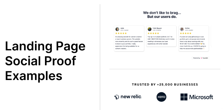
Happy Customers Everywhere: Getting good reviews and ratings is like getting thumbs up from your customers. If your app is getting 5 stars, flaunt it! Imagine your landing page shouting, “Look at all these happy users!”
Tell the World:
If your app got featured on a big website or you partnered with a well-known company, don’t be shy. Show off their logos on your page. It’s like saying, “Hey, these big names trust us, and you can too!”
Storytime with Solutions:
Ever read a story about someone just like you finding success with a product? That’s a case study. Use them to show how your app or service is a problem-solving hero.
For example, “Meet Tom, a busy dad who got fit with our 10-minute workout feature.”
In a nutshell, for a high-converting landing page in 2024, trust is your best friend. Share real stories, shout about positive ratings, and let everyone know your product is the real deal.
Implementing A/B Testing for High-Converting Landing Pages in 2024
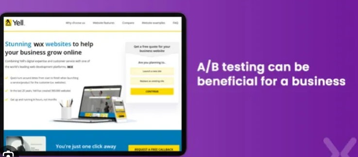
A/B testing is like trying on different outfits to see which one looks the best on you. But instead of clothes, we’re testing different versions of your landing page to find what works like magic for your visitors. Let’s break down why A/B testing is a big deal and how you can use it to make your landing pages shine in 2023.
A. What’s A/B Testing and Why It Matters What is it?:
A/B testing means comparing two versions of your webpage to see which one people like more. It’s like having two cupcakes with different frosting and figuring out which one everyone loves.
Why It Matters:
1. Smart Choices: A/B testing helps you make smart choices about your webpage based on what your visitors actually like.
2. Always Getting Better: It’s like leveling up your landing pages – you keep making them better over time.
3. More Clicks, More Conversions: A/B testing helps you figure out how to get more people to click that “Buy Now” button.
B. Testing Different Stuff (Headlines, Buttons, Pictures)
1. Headlines:
Why Mess With Them?:
Headlines are like the cool quotes on a movie poster. You want one that makes people stop and say, “I want to know more!”
Try This: Change the words or make it shorter or longer – see what makes people excited.
2. Buttons (Those Clickable Things):
Why Test Them?:
Buttons are like the “Let’s do this!” part of your page. Test different words and colors to get more people saying, “Yes, let’s do this!”
Try This:
Change the color of your “Sign Up” button or try a different word like “Join Now.”
3. Pictures (The Eye-Catchers):
Why Switch Them Up?:
Pictures are the first thing people notice. Test different ones to see what makes visitors stop and look.
Try This:
Swap out the picture of your product with a picture of happy customers using it.
C. Checking Results and Making Things Even Better
1. Checking What Happened:
Look at the Numbers:
Check out how many people clicked and what they did on your page. It’s like seeing if people liked your cupcakes at a bake sale.
Numbers That Matter:
Keep an eye on numbers like how many people signed up or bought something.
2. Making Changes:
Copy What Works:
If more people liked version A, use that one. It’s like sticking with the cupcake recipe that everyone loves.
Keep Testing:
A/B testing is not a one-time thing. Keep testing to make your page the best it can be.
Example:
Imagine you’re selling sunglasses. Test one version of your page with a headline saying “Cool Shades for Summer” and another saying “Sun Protection That’s Stylish.” See which one makes more people click that “Buy Now” button. That’s A/B testing in action!
In a nutshell, A/B testing is like having a secret recipe to make your landing pages the best they can be. Try different things, see what people like, and keep making improvements. It’s how you turn a regular webpage into a high-converting landing page superstar in 2024!
Utilizing Analytics for Better Landing Pages
Creating high-converting landing pages isn’t just about good looks; it’s about understanding what works and what doesn’t. Analytics, your trusty digital compass, can help you navigate this journey. Let’s break down how to use analytics in a simple way.
A. Setting up Analytics for Landing Page Tracking
To start, you need to set up a tool like Google Analytics to keep an eye on your landing page’s performance. It’s like having a backstage pass to see how your visitors are interacting with your page.
Example: Imagine Google Analytics as your landing page detective, telling you where your visitors come from and what they do on your page.
B. Analyzing Key Metrics (Conversion Rate, Bounce Rate)
Now, let’s talk about two important numbers: Conversion Rate and Bounce Rate.
1. Conversion Rate:
What it is:
This tells you how many people took the action you wanted (like making a purchase or signing up).
How to think about it:
If your page is a shop, the conversion rate is how many visitors actually buy something.
Example: If 100 people visit your page and 10 buy your awesome product, your conversion rate is 10%.
2. Bounce Rate:
What it is:
This tells you how many people left your page without doing anything.
How to think about it:
A high bounce rate is like people walking into a store and leaving without looking at anything.
Example: If 50 people visit your page, but 30 leave without clicking or staying, your bounce rate is 60%.
C. Iterating Based on Analytics Insights
Now, the cool part – using what you learn to make your landing page even better.
1. Identify Trends:
Look at your analytics regularly. Notice any patterns or changes.
Example: If you notice more people buy when you have a catchy headline, make sure to keep using those.
2. Try A/B Testing:
Test different versions of your page to see what works best.
Example: Change your button color from red to blue and see if more people click on it.
3. Be Quick to Change:
. Don’t be afraid to tweak your page based on what your analytics tell you.
Example: If analytics shout that your visitors love videos, consider adding more to keep them engaged.
In a nutshell, analytics is your secret weapon to understand your audience better and make your landing page a high-converting superstar. It’s not just numbers; it’s your guide to creating a page that people love. Keep it simple, keep it smart, and watch your landing page shine!
A. Recap of the 7 Ways to Build High-Converting Landing Pages
1. Understanding Your Audience:
Start by knowing your audience inside out. Create personas, conduct research, and tailor your landing pages to meet their specific needs.
2. Clear and Compelling Headlines:
Grab attention with headlines that speak directly to your audience and entice them to learn more about what you have to offer.
3. Engaging Visual Elements:
A picture is worth a thousand words. Choose visuals that resonate with your brand and captivate your visitors.
4. Optimizing for Mobile Devices:
In a mobile-driven world, ensure your landing pages are seamlessly accessible and visually appealing on various devices.
5. Building Trust with Testimonials:
Let your satisfied customers do the talking. Share testimonials and social proof to build trust and credibility.
6. Implementing A/B Testing:
Don’t settle for good; strive for great. Continuously test different elements to refine and optimize your landing pages for maximum impact.
7. Emphasizing Continuous Improvement
Success is not a one-time achievement; it’s a journey of constant refinement. Your landing pages, like your business, should evolve.
Regularly review analytics, listen to customer feedback, and be open to tweaking and enhancing your approach.
In the ever-changing landscape of online marketing, your landing pages stand as the first handshake between your business and potential customers. Make that handshake memorable, and watch your conversions soar.
Here’s to building landing pages that not only convert but also leave a lasting impression. Cheers to your success!
2. Focus on one Call to Action (CTA).
3. Give pages an authentic proof of value.
4. Make your landing page visually interesting.
5. Optimize landing page for mobile.
6. Reduce text on your landing page.
7. Ensure you’re speaking to your target audience.

